WordPress Tutorial: How To Configure The Media Settings
Even after a couple years working with WordPress I had not yet learned how useful the configuration options were on the media settings page (Settings › Media). Once I did, changing those settings has become a part of my default setup routine and an important way to control how WordPress generates and stores images.
Using The Date-Based Folder System
All images added to the WordPress media library are stored in a folder called ‘uploads’ which is located in the ‘wp-content’ folder. On the media settings page there is a checkbox under ‘Uploading Files’ that’s labeled, ‘Organize my uploads into month- and year-based folders.’
The default setting here creates a date-based folder system for your images. If your site has lots of images and you ever need to dig through your ‘uploads’ folder looking for them, this folder system can be a real time saver. However, this system also has a very small impact on performance. For this reason, sites not focused on images might consider disabling this feature. With fewer images it’s easier to search the ‘uploads’ folder when it doesn’t have subfolders.
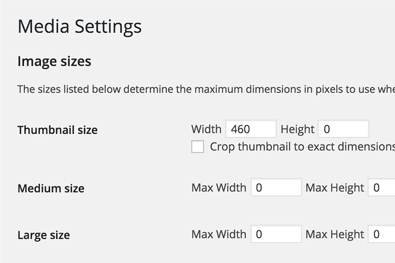
Control The Number Of Images Stored
The default setting on the Media settings page causes WordPress to create and store three extra sizes of every image you add to the media library. Few websites utilize all these images and they simply clog up your ‘uploads’ folder and add useless data to your database.
When setting up a WordPress site it’s important to know which of these image sizes your theme will be using. Most often that will only be the ‘thumbnail.’ Any sizes you aren’t using should have the ‘Max-width’ and ‘Max-height’ set to zero. This setting prevents WordPress from creating an image that size.
Cropping vs Not Cropping
The ‘Thumbnail size’ setting includes a checkbox that lets you control whether or not WordPress crops that thumbnail to an exact dimension. Most often websites required thumbnails to be a specific size and you will want to select this option.
It’s important to know that you can disable cropping on all image sizes by setting the ‘Max height’ to zero. Doing so will resize images only based on the width provided while maintaining their relative dimensions.
For Clients Who Don’t Resize Images
Not every client is willing or able to resize images in order to optimize site load times. And yet this is really very important, specifically for mobile viewers.
WordPress allows you to manage this issue by creating a ‘large’ size image that can be used instead of the ‘full’ sized image across your site, assuming you are able to modify your theme. If no dynamic image on your site will be displayed at larger than 800px, for example, set your ‘Max-width’ on the ‘large size’ image to that width and then images, no matter how large, will have a smaller version created that loads much faster.