Problem
The form felt generic, impersonal, and visually default.
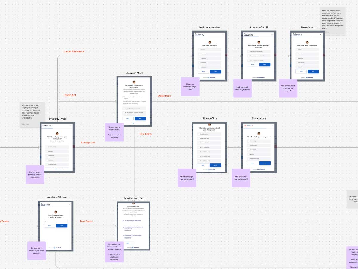
I redesigned moveBuddha's primary lead capture form from a generic, impersonal form into a friendlier guided flow that felt more like a conversation and captured more leads.
Result: +1–2% estimated boost in leads captured through A/B testing.
The form felt generic, impersonal, and visually default.
UX strategy, visual design, conversational copy, user flow, QA.
A friendlier guided flow that improved lead capture.
Added a chat-style theme, a friendly avatar, and an opening message: “Hi, I’m here to help you.”
Rewrote the language to use “you,” thank-you moments, affirmations, and clearer expectations.
Reduced redundant stages and gave users better context for what was happening next.
Replaced default form styling with a more polished, approachable interface that felt intentional.
estimated boost in leads captured.
This project shows how I improve conversion by treating UX, visual design, interface copy, user flow, QA, and business goals as one connected problem.
If you need someone who can improve a website without losing sight of users, revenue, content, code, or production reality, I’m probably worth a conversation.